Color is a powerful tool in visual communication. It has the ability to evoke emotions, create associations, and convey messages without even using words. When used correctly, colors can significantly enhance the impact of a design or brand.
One key aspect of using colors effectively is through the use of a color scheme. In this comprehensive guide, we will delve into the world of color schemes – what they are, why they matter, and how to create one that works for you.
What is a Color Scheme?
A color scheme, also known as a color palette or color theme, is a set of predetermined colors used in design and branding to create visual harmony and consistency. It is a crucial aspect of creating a cohesive and aesthetically pleasing look that effectively conveys the desired message.
A color scheme typically consists of several colors – often ranging from three to six – that work together harmoniously, following a specific set of rules or principles. These colors are carefully chosen based on their relationships with one another, such as complementary or analogous colors, to create a balanced and visually appealing composition.
A compelling color palette can elevate layout and design. Check examples in this Instagram color palette article.

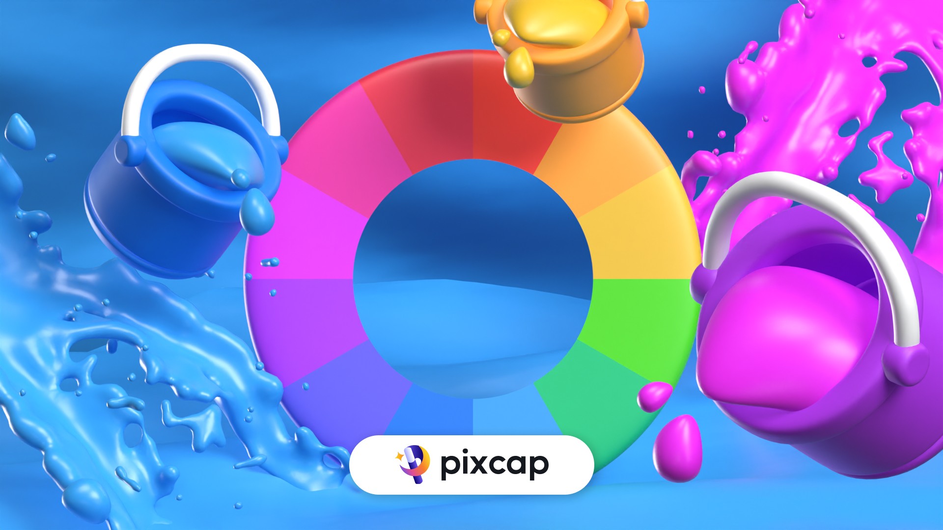
Pixcap’s palettes is a new feature that can help you apply pre-made color schemes quickly and easily on your illustrations → TRY NEW FEATURE HERE
7 Types of Color Schemes & Their Characteristics
1. Monochromatic
This design approach utilizes various tints, shades, and tones within a single base color or hue to create depth while maintaining a harmonious design. It offers aesthetic unity and evokes a soothing sense of visual rhythm.
Characteristics of monochromatic schemes:
They utilize tints and shades derived from one base hue.
They promote consistency and captivate viewers through variations in lightness.
They are often employed in minimalistic designs or when the content needs to take center stage.
2. Complementary
A complementary color scheme comprises two colors that are opposite each other on the color wheel. This approach creates a strong contrast and visual tension, making it perfect for creating attention-grabbing designs.
Characteristics of complementary schemes:
They use colors that are diametrically opposed to each other on the color wheel.
They generate bold, eye-catching effects.
They work well with high-contrast designs.
3. Analogous
Analogous color schemes use colors that are adjacent to each other on the color wheel, creating a harmonious and cohesive design. This approach is often used in designs where a sense of unity and tranquility is desired.
Characteristics of analogous schemes:
They utilize hues that are next to each other on the color wheel.
They create a smooth transition of colors.
They are known for their calming and relaxing effects.
4. Triadic
The triadic color scheme uses three evenly spaced colors on the color wheel to create a bold and dynamic design. This approach offers a high level of contrast while maintaining balance and unity within the composition.
Characteristics of triadic schemes:
They use hues that form an equilateral triangle on the color wheel.
They create a strong visual contrast while maintaining balance.
They are versatile and can be used to create both vibrant and subdued designs.
5. Tetradic (Double Complementary)
Tetradic color scheme utilizes four colors, two complementary pairs, making it a high-contrast and vibrant option for design. It offers a wide range of possibilities and can create both harmonious and energetic effects.
Characteristics of tetradic schemes:
They utilize four colors, forming two complementary pairs on the color wheel.
They offer a wide range of options for creating dynamic designs.
They can be challenging to balance but can result in visually striking compositions.
6. Split Complementary
The split complementary color scheme uses a base color and the two colors adjacent to its complement on the color wheel. This approach is a more subtle version of the complementary scheme, offering a balanced blend of contrast and harmony.
Characteristics of split complementary schemes:
They use a base color and its two adjacent colors to its complement on the color wheel.
They offer a softer contrast compared to the complementary scheme.
They are versatile and can be used to create both bold and subtle designs.
7. Neutral
Neutral color schemes use colors such as white, black, gray, and brown to create a balanced and understated design. These hues are often used as backgrounds or accents in combination with other color schemes.
Characteristics of neutral schemes:
They utilize non-colors like white, black, and grays.
They can be combined with other color schemes to create balance and contrast.
They offer a clean and minimalistic look.
How to Choose a Color Scheme
Leverage Natural Inspiration
First thing's first: take inspiration from the world around you.
Nature offers a plethora of visually striking combinations that we can put to use in our designs. The vibrant hues that paint autumn leaves or the calm serenity of a sunset at a beach; these are full of potential color schemes waiting to be utilized.
Colors derived from nature often blend harmoniously together. Think warm sandy beaches paired with cool seawater blues or lush green fields under clear blue skies for instance—these warm and cool colors all evoke feelings, perceptions, and reactions on their own.
Set a Mood for Your Color Scheme
After selecting your source of inspiration, think about the mood you want your design, whether it's an interior space, website or outfit, to set.
Are you trying to create an energetic atmosphere? Opting for bright and vibrant spring colors might be just what you need.
On the other hand, softer tones often exude tranquility and warmth which could serve well if you strive for relaxation and comfort. Make sure that your colors align with the emotions associated with them as well.
Consider Color Context
While choosing your scheme, consider the context in which it'll appear—evaluate lighting settings, any existing materials or elements and even cultural connotations.
For instance, while red signifies luck in Asian cultures, it may symbolize danger elsewhere—and this difference matters enormously depending on who is intended to receive your design message.
Refer to Your Color Wheel
The color wheel is a useful tool that can help guide your color choices and determine which colors will work well together. The basic color wheel includes primary, secondary, and tertiary colors that can be mixed to create new shades.
You don't have to stick to traditional color schemes either; the possibilities are endless with complementary, split-complementary, analogous, triadic and tetrad
Draft Multiple Designs
Don’t settle quickly—it’s important to give adequate thought time into exploring multiple potentials before deciding on any color scheme.
By testing many ideas through drafts or mockups initially—you ensure selecting what best resonates with both: you personally as a designer—and also caters efficiently to your audience.
How Do Color Schemes Work?
It's also important to know how these color schemes work together and how they can be manipulated to achieve specific results.
Color Wheel
The color wheel is a visual representation of the relationship between colors. It's made up of 12 hues arranged in a circular format with primary, secondary, and tertiary colors. Understanding the color wheel can help you choose complementary colors to create contrast or analogous colors for a harmonious blend.
Primary Colors
Primary colors include red, blue, and yellow. These are labeled as 'primary' because they form the basis for all other hues and cannot be derived from any combination of other colors.
Red serves as an energizing hue widely associated with passion.
Blue embodies tranquility and emits cool vibes.
Yellow stands out as the radiant source that symbolizes warmth and luminosity.
These primal shades embody basic emotional reactions, making them paramount in any discussion revolving around color schemes names or the concept of what is a color scheme itself.
Secondary Colors
Secondary colors - green, orange, and purple - are constructed by combining two primary colors at full saturation.
Green remains synonymous with nature as it merges blue's serenity with yellow’s energy.
Orange melds red’s intensity with yellow’s vibrancy which exhibits enthusiasm.
If you mix blue's calm demeanor and red's fervor together you get Purple, often correlating it with luxury empires.
Tertiary Colors
Tertiary colors arise when you merge a primary color with its nearest secondary partner on the wheel.
Example:
Yellow-orange: Combining yellow's luminance and orange's intensity brings out the bright personality that appeals to many.
Red-Purple: The rich blend of red’s fervor with purple's sumptuousness exudes confidence, making it a popular pick among creative minds.
How to Use Color Palettes
Work in Grayscale
By beginning your designing process in grayscale — using only black, white, and shades of grey — these elements become prominent targets for refinement.
Importantly, mastering this technique not only improves overall aesthetic appeal but can enhance usability in UI design by ensuring visual accessibility for all users.
Use the 60–30–10 Rule
60% forms the dominant hue (background tone), introducing unity to the design.
30% represents a secondary color - contrasting with the primary color while supporting its dominance.
Lastly, just 10% comes from accent colors that punctuate small areas neatly without overwhelming other hues.
The judicious application of this rule permits a harmonious collocation that is both visually balanced and sophisticated.
Color Psychology
As colors play a vital role in evoking emotions, good designers must make deliberate decisions to connect with their audience.
This aspect of color psychology is not only essential for branding but also influences conversion rates in marketing campaigns.
Red: It stimulates urgency and evokes a sense of excitement, making it suitable for use by e-commerce sites such as Amazon's "Buy Now" button.
Blue: It links to trust and professionally, so brands like Facebook and LinkedIn use it in their logos.
Yellow: It expresses cheerfulness - appealing to children or playful brands seeking a bright image.
Test on Variety of Screens
As design moves away from the desktop towards smaller screens such as mobile phones, tablets, or smartwatches, there is a need to cater to different resolutions and formats.
Use responsive design techniques such as media queries or adaptive layouts for fluidity on various platforms.
Testing on multiple devices ensures visual consistency and accessibility across screens of different sizes.
Use White Space Wisely
White space (or negative space) refers to the portion of a layout that remains untouched by design elements. It is not just a blank area; it serves as the breathing room for elements.
Adequate white space leads to a visually attractive design and improves legibility.
Additive & Subtractive Color Theory
Color theory is a set of principles used to determine how colors interact with one another. There are two main color theories: additive (RGB) and subtractive (CMYK).
CMYK
The concept behind this specific model involves mixing colors like Cyan, Magenta, and Yellow – following similar patterns you may recall from art class when painting; hence it earns its descriptive 'subtractive'.
This system conceives that one begins with white (the presence of all colors), then gradually eliminates or 'subtracts' certain colors until reaching the desired outcome.
When all three primary colors (Cyan, Magenta, Yellow) combine at their highest concentration levels - we're left with black due to the subtraction of light. This is why we use CMYK for printing purposes.
RGB
RGB stands for Red, Green, and Blue. It's part of the additive color model, which means each color added contributes to achieving a lighter outcome.
In this method, you're not literally 'adding' light but rather changing the screen's composition through adding pixels of said shades. Similar to CMYK, adding each color at 100% saturation results in pure white.
However, if you add all three primary colors together with the same proportion, the final composition will turn into white instead of black. We use RGB mainly for digital displays.
Color Tools
With understanding color basics, it's useful to know design tools that make playing with color schemes more accessible.
Adobe Color
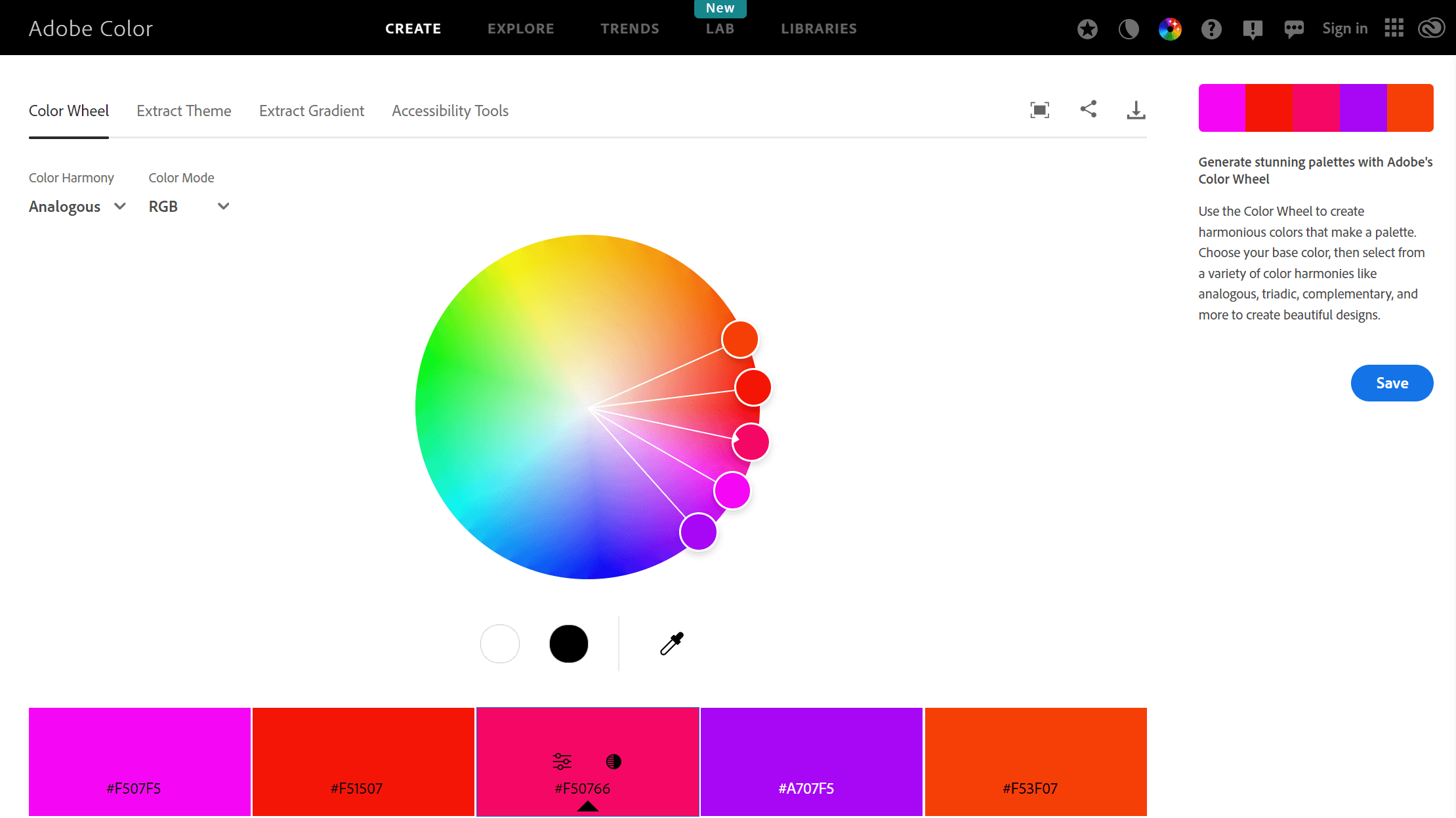
Adobe Color CC is a versatile tool that excels in designing color themes and palettes.
You can select your desired colors and adjust the rules to your specific needs. For instance, you can choose between analogous, monochromatic, or complementary schemes.
Moreover, you can explore pre-designed color themes by other creatives if you're looking for inspiration.
Site Palette (Chrome Extension)

Site Palette is a convenient and efficient Chrome extension that extracts color palettes from any website you visit.
It's an excellent tool to use for inspiration or if you come across a design you particularly like. Simply click on the extension icon, and it will generate a color palette based on the colors used on the webpage.
You can also adjust the number of colors generated as well as customize the output format.
Conclusion
Color theory and its practical applications are essential elements in design. Understanding the different color models and utilizing tools available can help you create harmonious and visually appealing designs.
So, experiment with different color schemes, keep an open mind, and trust your eye for a beautiful result that will capture attention and leave a lasting impression.