In the vast canvas of design, the contrast principle stands out as a potent stroke for visual impact and clarity. It's not just a subtle shadow or a brighter hue—it's a strategic masterstroke that can elevate a design from mundane to unforgettable.
Understanding and harnessing this principle is crucial for graphic designers, web developers, and artists alike. Explore with us the key principles of contrast, and learn how to wield its power for design that resonates.
Contrast Principle of Design Definition
The contrast principle is a graphic design concept that highlights how two different elements, when placed together, can enhance each other's impact. It's a visual play of opposites that demands attention, establishes hierarchy, and creates visual interest throughout. When implemented thoughtfully, this principle can guide a viewer's eye across a design in a deliberate and harmonious way.
Understanding and applying contrast is an art form. It involves using different visual elements, such as color, size, shape, texture, and value to create a dynamic visual experience. It’s not just about making important elements stand out; it’s about ensuring that they do so in a way that makes sense and reinforces the purpose of the overall graphic design.
Key Elements of Design Contrast
Color Contrast
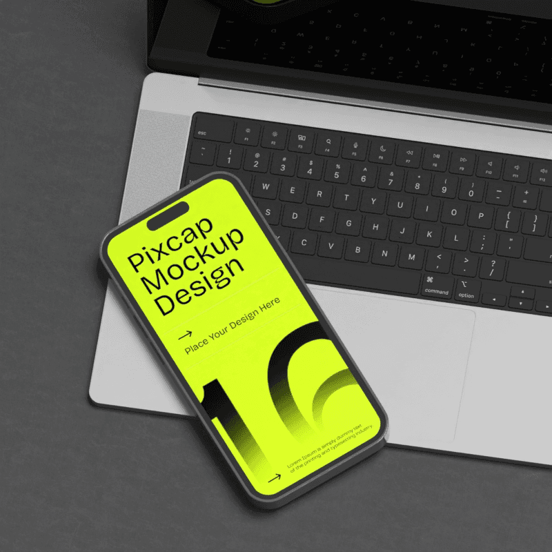
In the realm of color theory, contrasting tones demand attention. Think a vibrant red against white background, a cool, oceanic blue, or a deep, velvety purple juxtaposed with sunny yellow. The difference in color can make a design pop or establish brand identity in the most vivid way.

CLICK HERE TO USE THIS TEMPLATE
Size Contrast
Play with proportions to lend layers to your design. Size contrast can be subtle or stark, with the scale of elements dictating their significance. How much space a headline takes up compared to body text, for example, or the size of an image to its surrounding negative space, can drastically alter the design's balance.

CLICK HERE TO USE THIS TEMPLATE
Font Contrast
The choice of typeface alone can convey contrast in personality and tone. Pair a flowing script with a structured sans serif for an elegant contrast, or marry a bold, attention-grabbing font with a more understated one for emphasis.

CLICK HERE TO USE THIS TEMPLATE
Texture Contrast
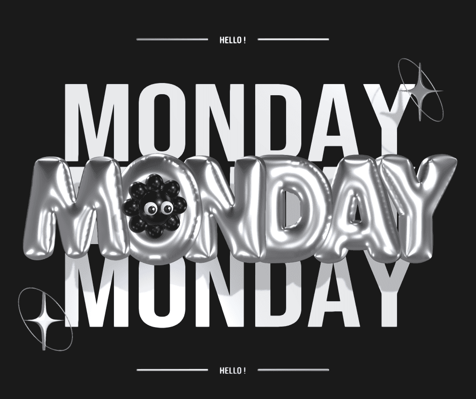
Texture adds a tactile quality to graphic design. From glossy to matte, smooth to rough, the textural can create contrast that can invite touch without a hand ever reaching out. It's the unspoken layer of depth that complements a visual contrast, making it feel more alive.

CLICK HERE TO USE THIS TEMPLATE
The Benefits of Applying the Contrast Principle
When contrast is skillfully utilized, it offers several advantages that extend beyond mere aesthetics.
Enhancing Visual Hierarchy and Emphasis
Contrast is the architect of visual hierarchy. It directs the gaze and shapes the understanding of a design's content. By contrasting elements, contrasting colors, or contrasting shapes designers can guide the viewer’s experience, ensuring that the most important message is the most visible one.
Seeding Better User Experience
Contrast plays a key role in user experience (UX) design. It assists in guiding users through a website, app, or physical space, helping them find what they need and complete tasks with clarity and ease.
Brand Differentiation
In a market oversaturated with visuals, brand distinguishes itself through contrast. Introducing differentiation into a brand’s imagery or packaging is foundational in setting a brand apart, making it recognizable and memorable.
Implementing Contrast in Graphic Design
To put the principles of design contrast to work, designers must learn to wield its various forms with finesse.
Color Contrast at Its Finest
Aside from the classic black and white pairing, colors on the opposite ends of the light spectrum present the most striking contrasts. Use complementary colors to bring excitement to a design, while analogous colors offer subtler contrast for a more serene effect.
Size Does Matter
Experiment with size to create contrast. A large headline followed by smaller subtext cues the reader to the order of importance, while an unexpected shift in size can introduce an element of surprise.
The Written Word in Contrast
Typography is a playground for creating contrast. It's not just about bold and italic, but about the contrasts between typefaces themselves. Varying weights within a typeface can also elevate the contrast within the text without changing the font.
Tactile Temptations with Texture
Textural contrast can be literal or implied, but the effect is always engaging. In physical design, feel the texture to experience the contrast. In digital design, suggest textures through gradients and shading that provide depth and intrigue.
Tips for Effective Implementation of the Contrast Principle
Harnessing the power of contrast in graphic design requires a thoughtful approach and a keen eye for balance. Here are some guidelines for making sure your designs benefit from contrast without becoming overwhelming.
Consistency in Contrasting Elements
While contrast can be visually striking, it should also be consistent throughout other elements of the design to avoid too much contrast. Set rules and guidelines for contrast use to ensure that it's working to complement rather than conflict
The Art of Balancing Contrast with Harmony
Contrast should be harmonious. The duality between two contrasting elements is what makes them work together to create a balanced composition. Strive to ensure that the combination of contrast you employ still allows the design to feel cohesive and unified.
Testing and Iterating for Optimal Results
Designing with contrast is a process of continuous refinement. What seems effective in one iteration of graphic design may be perfected in another. Test hard contrasts against softer ones to see which sets the design’s elements off to their best advantage.
Conclusion
The contrast principle is not static. It evolves with design trends, new technologies, and changing audience expectations. What remains constant is its foundational principles of design and role in the creation of meaningful, impactful designs.
Designers who master the use of design principles of contrast will always have a powerful tool in their creative arsenal—one that can transform the mundane into the extraordinary. By understanding the fundamentals and experimenting with the many forms contrast can take, you can elevate your work to new heights. Welcome the design principles of contrast into your design philosophy, and watch your creations take on a whole new vibrancy and life.


