Print advertisements have long been a powerful medium for brands to reach their audience, convey their message, and drive engagement. Over the years, we've seen numerous good print ads that have not only successfully promoted products but also revolutionized the advertising industry.
These ads possess a combination of creativity, clear messaging, and a deep understanding of the target audience. They push boundaries, challenge stereotypes, and sometimes, they even manage to change societal norms and perspectives.
This article will take you through the 15 best print ads of all time, providing a glimpse of the ingenuity that went into creating them.
The Best Print Ads and Their Impactful Designs
1. Volkswagen "Think Small"
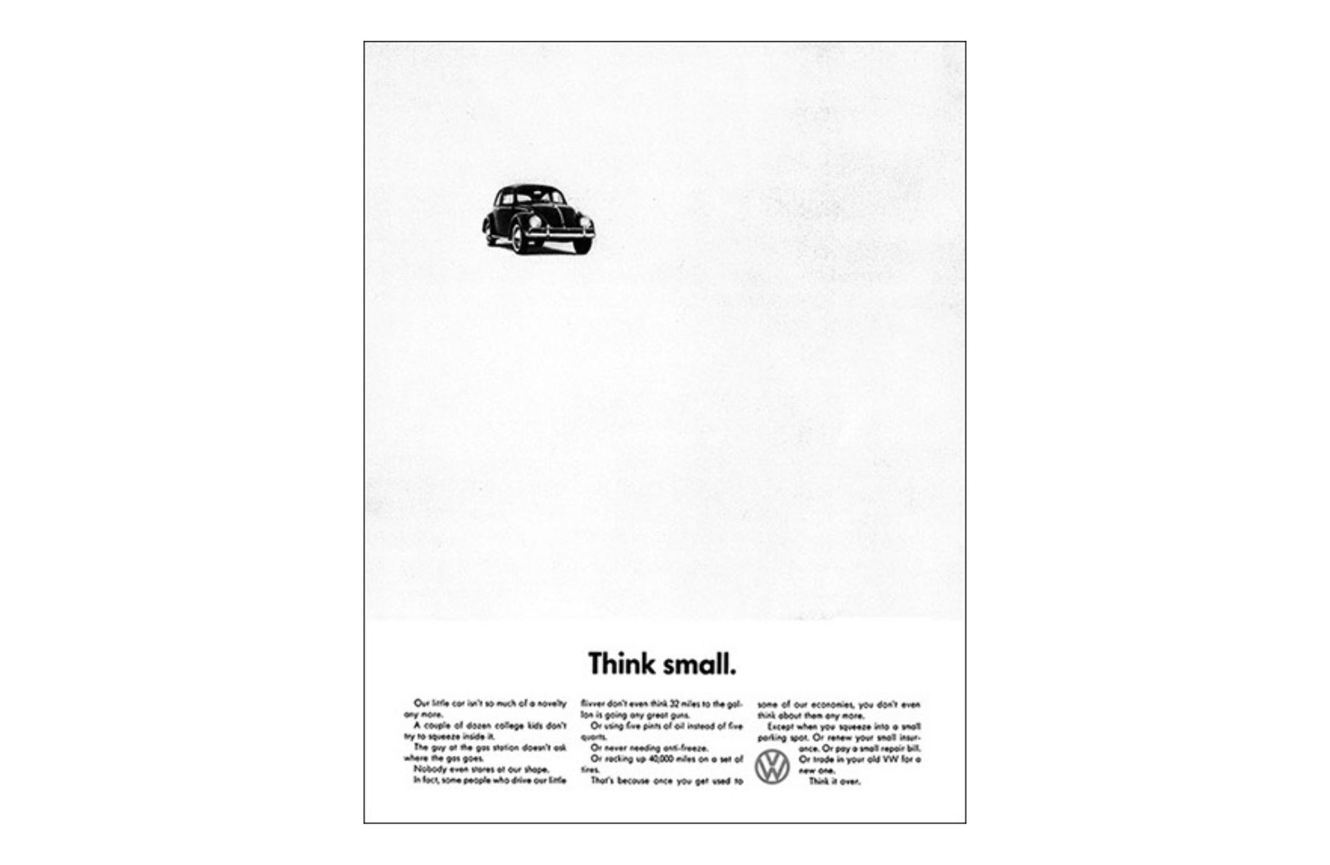
The "Think Small" ad by Volkswagen broke the mold by celebrating the compact size of the Beetle. Instead of following the traditional advertising path of glorification, it cleverly used honesty and simplicity to stand out.
The minimalist design with plenty of white space emphasized the car's small size, while the witty copy humorously addressed and diffused any perception of the car's inadequacy due to its size. This iconic ad created a buzz in the automotive industry and set a new standard for honesty and humility in advertising.
Volkswagen's "Think Small" print ad showed us that sometimes less is more, and being straightforward can make a bigger impact.
2. Pringles Galaxy
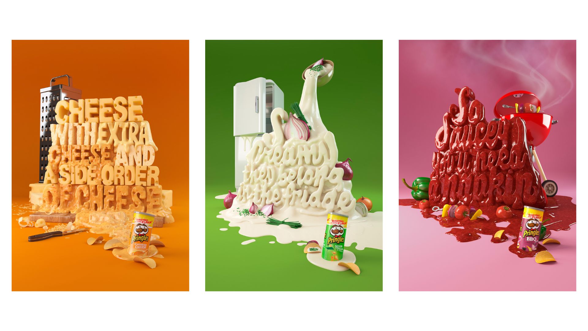
Who can resist a mountain of cheese, BBQ, or sour cream and onion sauce on chips? This print ad for the popular potato chip brand utilized strong visuals to convey the product's irresistible taste.
The use of 3D illustrations with vibrant colors and bold typography immediately catches the attention of the viewer in a way that a simple photograph could not achieve. This ad is a great example of how creative 3D design can elevate a product's appeal.
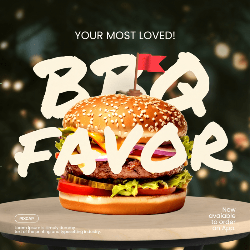
Start using 3D illustrations to design your impactful print ads, magazine ads, posters, flyers with Pixcap templates.


3. Play-Doh: Handcrafted Print Ads
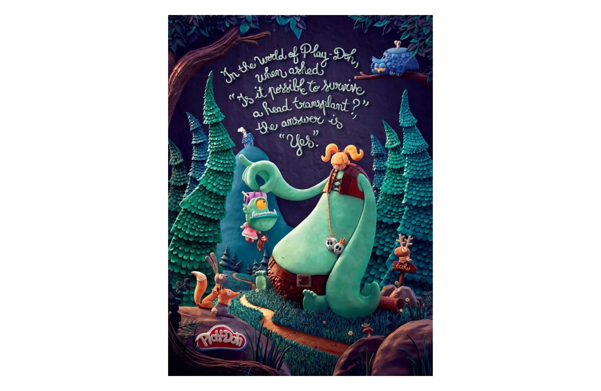
Play-Doh's "Handcrafted" print ad series, created by advertising agency DDB Paris, is one of the best award winning print ads, showcasing the brand's creativity. Each ad featured a well-known character made entirely out of Play-Doh, with no CGI or retouching.
These ads not only highlighted the brand's product but also displayed its potential as an artistic material. The attention to detail and the use of bright colors in these ads captured the imagination of both children and adults, making Play-Doh a must-have toy for creative play.
4. Faber-Castell "Idea"
The "Idea" ad by Faber-Castell, a German manufacturer of writing and drawing tools, used a simple yet powerful design to promote their product. The ad featured a lightbulb drawn with a pencil, highlighting the idea-generating capabilities of their pens.
This clever use of visual metaphor and contrast effectively conveyed the message that Faber-Castell's pens are the perfect tool for bringing ideas to life. It also positioned the brand as a creative and innovative choice for artists and writers.

5. Foxy Asso Ultra Paper Towels
Less is more, true. But sometimes, exaggeration can make you laugh and remember a brand. That's exactly what Foxy Asso Ultra Paper Towels did with their print ad campaign.
"One sheet is enough" was the tagline for this campaign, and each ad featured a comical and exaggerated situation where only one sheet of Foxy Asso Ultra Paper Towel was needed to clean up the mess.
This approach not only emphasized the product's absorbency but also added an element of humor that made it memorable and shareable. The use of colors and simple illustrations further enhanced the playful tone and made the ad stand out in a sea of similar products.

6. Lego Isn't Just a Toy
"Logo isn't just a toy, it's whatever your child makes of it" - this is the message conveyed by Lego's print advertisement. Instead of focusing on their popular building blocks, the ads showcased the endless possibilities and creative freedom that Lego offers to children.
The tagline "Sparking your imagination" of the brand further reinforced this message and positioned Lego as a must-have for any child's development. Overall, this campaign successfully showcased the product's unique selling points in a creative and relatable way.

7. Revolution Cooking's R180 Smart Toaster
At first glance, the magazine ad for Revolution Cooking's R180 smart toaster might be mistaken for a board of color swatches. However, upon closer inspection, it becomes evident that it is not merely a color spectrum but depicts various levels of perfectly toasted bread.
This playful and innovative approach places an unexpected spin on showcasing the toaster's effectiveness. It cleverly communicates the precision of the toaster's settings and its ability to achieve the desired toastiness every time.
This visual representation of the product's core feature not only catches the viewer's eye but also leaves a lasting impression.

8. Whiskas
Whiskas took a different approach, presenting their product as one that caters to the innate instincts and needs of cats. Their campaign featured images of domestic cats chasing their 'wild' counterparts, highlighting their predatory instincts.
This creative and insightful campaign successfully associated the Whiskas brand with a deep understanding of feline nature, resonating with cat owners who want to provide the best care for their pets.

9. Capacítate
Capacítate's campaign uses a 3D visual approach to promote their entrepreneurship courses, focusing on the concept of "placing your business on the map."
The advertisements cleverly incorporate the universally recognized 'pin' icon, transforming it into different forms of businesses – a café, a flower shop, and a restaurant. This visually striking representation effectively conveys the message of how their courses can help entrepreneurs stand out and succeed in their industries.

10. Coca-Cola "Try Not to Hear This"
Coca-Cola broke the barriers of traditional advertising with its "Try Not to Hear This" campaign. This campaign cleverly engages the viewer's senses beyond the visual, invoking auditory imagery.
The print ads showcase iconic, familiar images - a bottle of Coca-Cola being opened, the effervescent fizz of a poured drink. These visuals are so deeply ingrained in our collective experience that they trigger the corresponding sounds in our minds, creating an 'audible' print ad.

11. Piknic Électronik
Piknic Électronik, a super cool electronic music festival in Montreal, has this awesome print ad campaign that you can spot all around the city and subway stations. They throw this festival every Sunday during the summer in an outdoor park and promote it with these eye-catching ads that combine fruits and music gear.
The bright and pop-art style of the photos really grab your attention, and the unique pairing of items shows just how innovative and exciting the festival is.
The use of familiar fruits adds a playful and relatable element to the ads. This campaign effectively conveys the fun and energetic atmosphere of Piknic Électronik, making it a must-attend event for music lovers.

12. Pass the Heinz
In a bold move, Heinz recreated an advertising campaign from one of the most popular TV shows ever - Mad Men. The original concept and ads were created by Don Draper, the show's protagonist, but were never approved in the fictional world of the show. However, Heinz brought these ads to life in real life.
The campaign consisted of three minimalist print ads with mouth-watering images of food that would pair perfectly with Heinz ketchup. The catchphrase "Pass the Heinz" was simple yet effective in conveying the idea that no meal is complete without this iconic condiment.

13. McDonald's "Open All Night"
McDonald's is known for its creative and memorable advertising campaigns, and their "Open All Night" campaign was no exception.
The ads were effective in conveying the message that McDonald's is open 24/7 to satisfy those late-night cravings. The use of playful and relatable scenarios, along with the well-known McDonald's logo, made these ads instantly recognizable.

14. Ikea iDealisk
In June 2019, when Apple unveiled its new Mac Pro, the design drew unkind comparisons due to its decidedly cheese grater-like appearance. IKEA Bulgaria didn't miss a beat and jumped into the ensuing discussion.
The ad incorporated a lower-case 'i' in the product name, reminiscent of Apple's iconic branding. Showcasing one of its own products, a cheese grater, IKEA playfully titled it the "iDealisk", taking a lighthearted jab at Apple's expense.

15. Norwegian Airlines
The company ingeniously utilized the design of the Norwegian flag, which contains elements of other national flags. By creatively outlining these hidden flags within their own, they simultaneously highlighted various destinations on their flight routes.
Each outlined flag was paired with its corresponding destination and a competitive ticket price. This clever, multi-layered strategy not only maximized their ad space but also visually communicated the extensive reach of Norwegian Airlines' network.

What Makes a Good Print Ad?
A good print ad is one that catches the reader's attention and effectively conveys its message, all while standing out among other advertisements. Here are some key elements that make a good print ad:
Eye-catching design: A visually appealing design is essential for grabbing the reader's attention. This can include bold colors, interesting graphics such as 3D, or creative layouts.
Clear message: The ad should have a clear and concise message that is easy for the reader to understand. This can be achieved through the use of attention-grabbing headlines or a simple and straightforward tagline.
Relevant and relatable content: A good print ad should be relevant to its target audience and contain content that resonates with them. This could include using humor or emotions that the target audience can relate to.
Branding: No matter how creative the ad is, it should always prominently feature the brand's logo and name. This helps with brand recognition and recall.
Conclusion
We hope these print advertising examples have given you some ideas for your own advertising efforts. Remember, the key is to be creative, relevant, and memorable to effectively reach and engage with your target audience. With these elements in mind, you'll be well on your way to creating successful print ads that stand out from the rest!
Browse 10,000+ 3D graphics, icons, characters, and templates on Pixcap. Design creative print ads with ease!

